
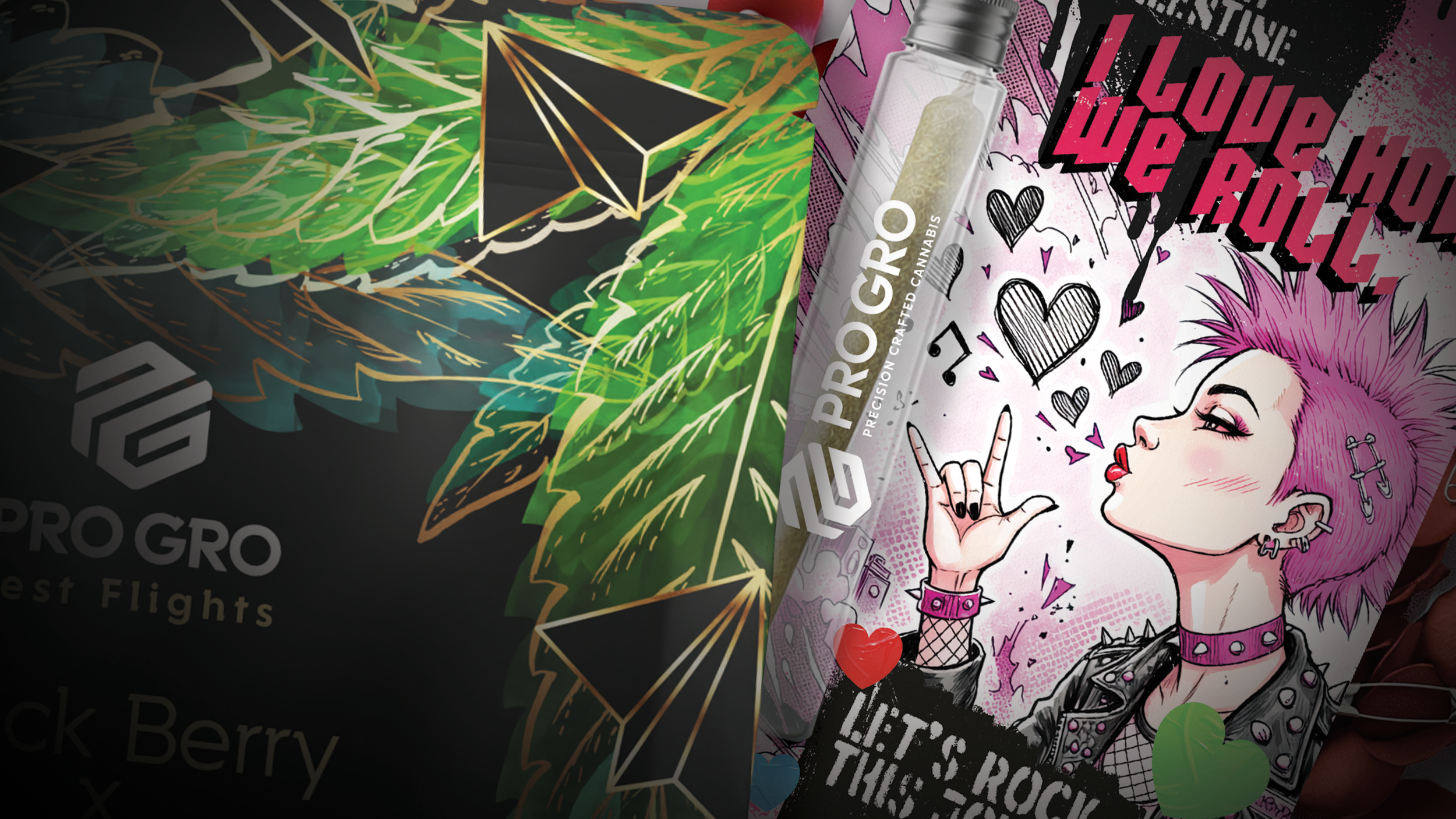
short gig. loud output.
ProGro brought me on as Creative Director to bring real process to a program moving faster than its systems.
The Real Problem
ProGro wanted a monthly strain program — a reason to feel "new" every month, even though the underlying strains weren't actually new. The real differentiator was the grow facility itself, and almost nobody outside it knew that story. A full site rework was the bigger opportunity, but the assignment in front of me was smaller: build the packaging and program from scratch instead.

BUILT LIKE A FLIGHT,
NOT A MENU.
Test Flights came from the same model as a craft beer flight — come in, try a few, find what you like. Applied to cannabis, that meant treating indica, sativa, and hybrid as a set to sample, not a wall of separate products to choose blind.

A PAPER AIRPLANE,
NOT A BIPLANE.
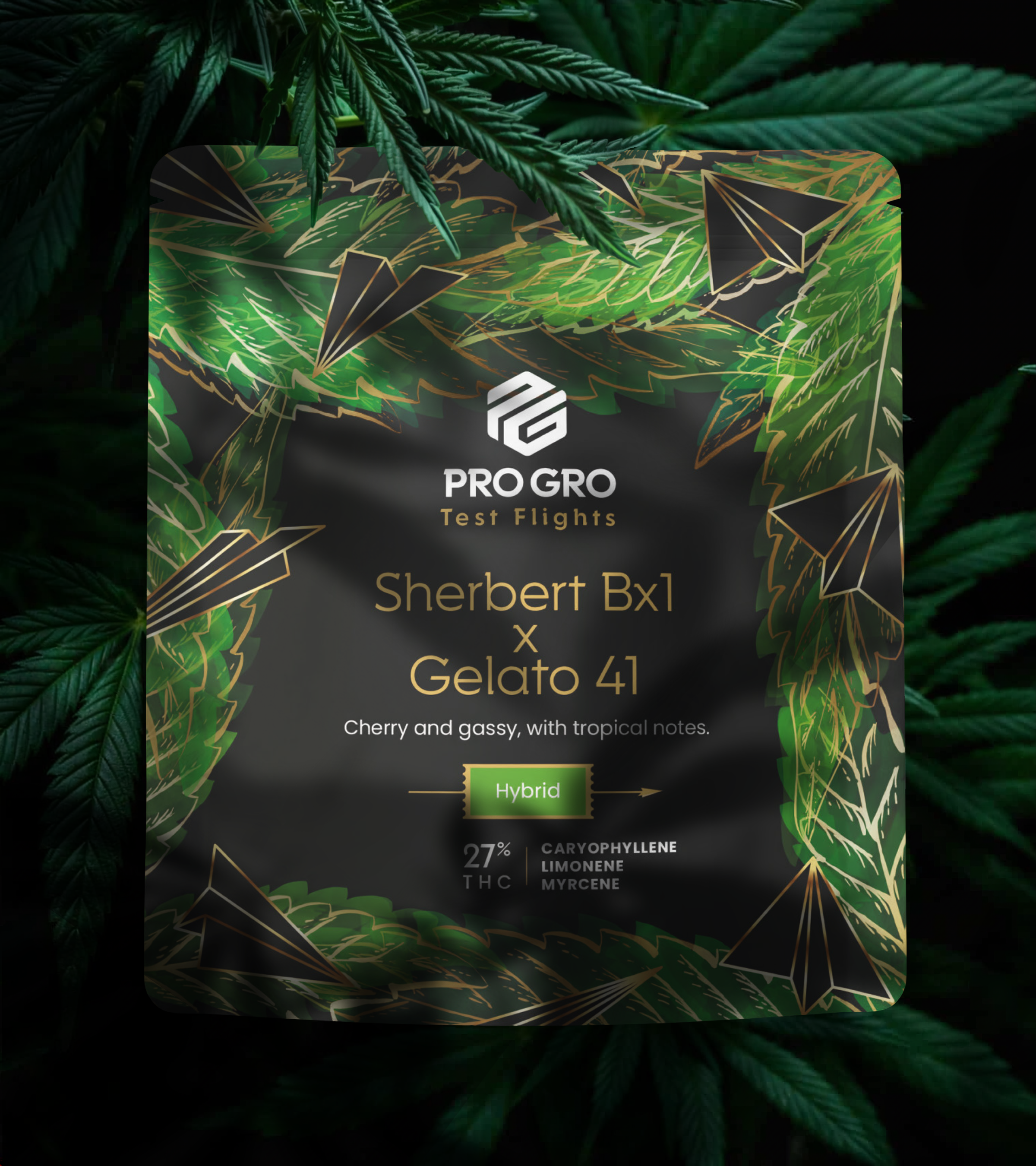
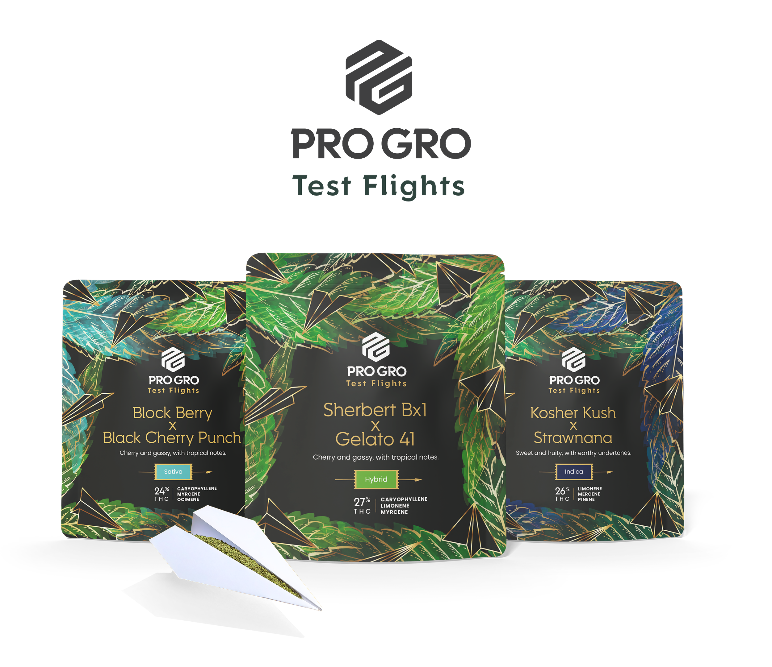
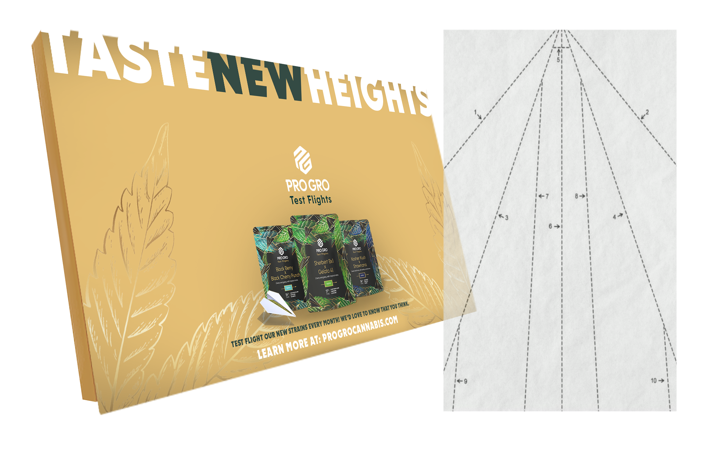
The obvious aviation reference would have been something mechanical — my father was Air Force, so cargo planes and fighter jets were an easy first instinct. But a joint starts as paper, and a paper airplane is the more honest link: fold it, and you're already halfway to rolling one. The packaging leans into that implication without ever stating it outright — cannabis tucked into the fold of a paper plane, hinting at the next step instead of showing it.
The image does a second job too. A paper airplane is what gets tossed across a room mid-thought — the posture of an idea still in progress, not a finished one. That felt like the right symbol for a program built around testing new strain combinations, not just selling a finished product.
GOLD LINEWORK MADE A PAPER AIRPLANE LOOK EXPENSIVE.
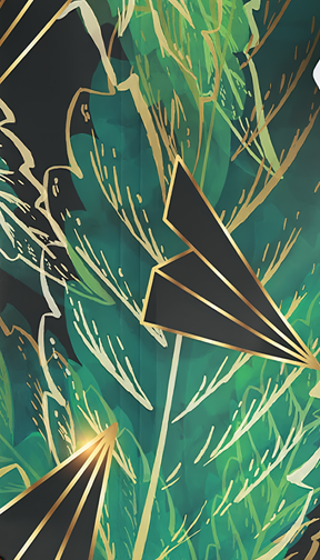
Gold is close to a cliché in this category — a shortcut brands reach for and usually botch, loud and overdone in a way that reads cheap instead of premium. I used it anyway, on purpose, betting that restraint could redeem it: a fine gold line tracing the fold creases of the paper airplane, set against a rich dark background instead of a wash of gold across the whole bag. Going against the obvious version of an idea, not avoiding the idea itself — the same instinct I'd bring to a played-out typeface or an overused filter. The tool or image was never the problem. Avoiding it on principle is usually the safer move, not the more original one.
WHAT'S NEW? PACK YOUR BAGS.
The color treatment leaned into travel, not cannabis category cliché — a gradient closer to an expensive textile you'd wear somewhere exotic than anything typically found on a dispensary shelf. Dark, rich backgrounds did what photography alone couldn't: they read as premium, and travel carries its own pull — curiosity, the allure of a journey worth taking. A new strain dropping every month gave people an actual reason to come back and check: what's new this time?
READABLE FROM FOUR FEET AWAY, OR IT DOESN'T WORK ON A SHELF.
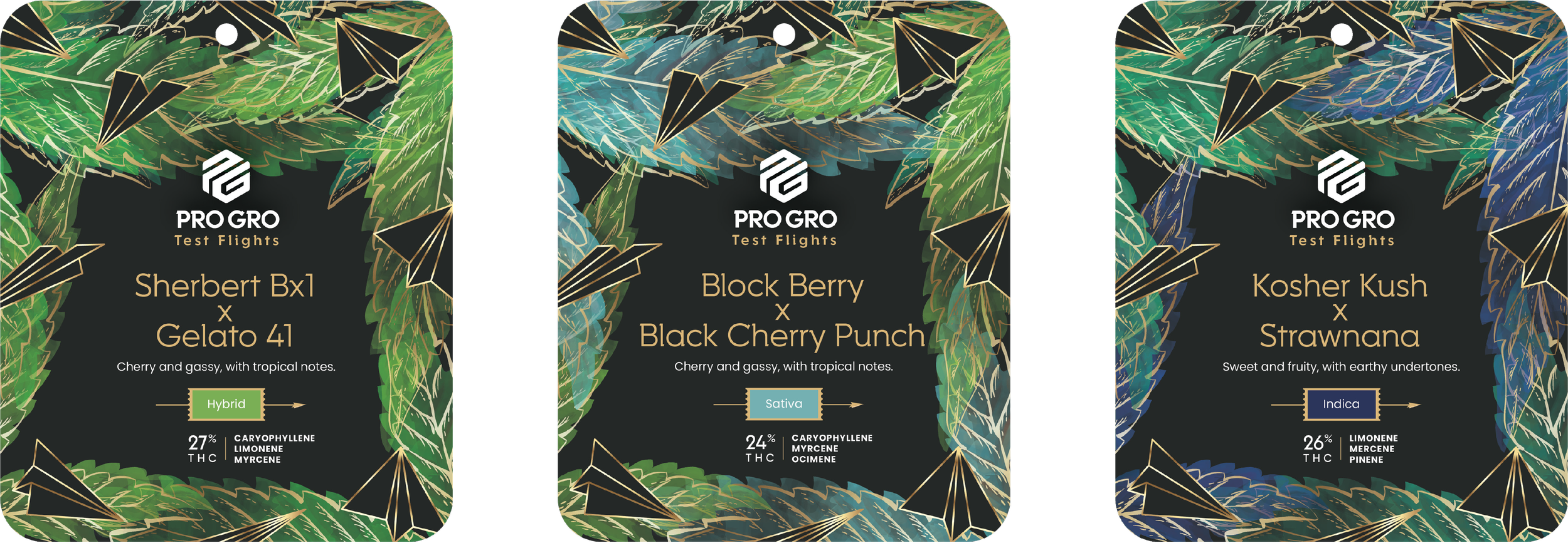
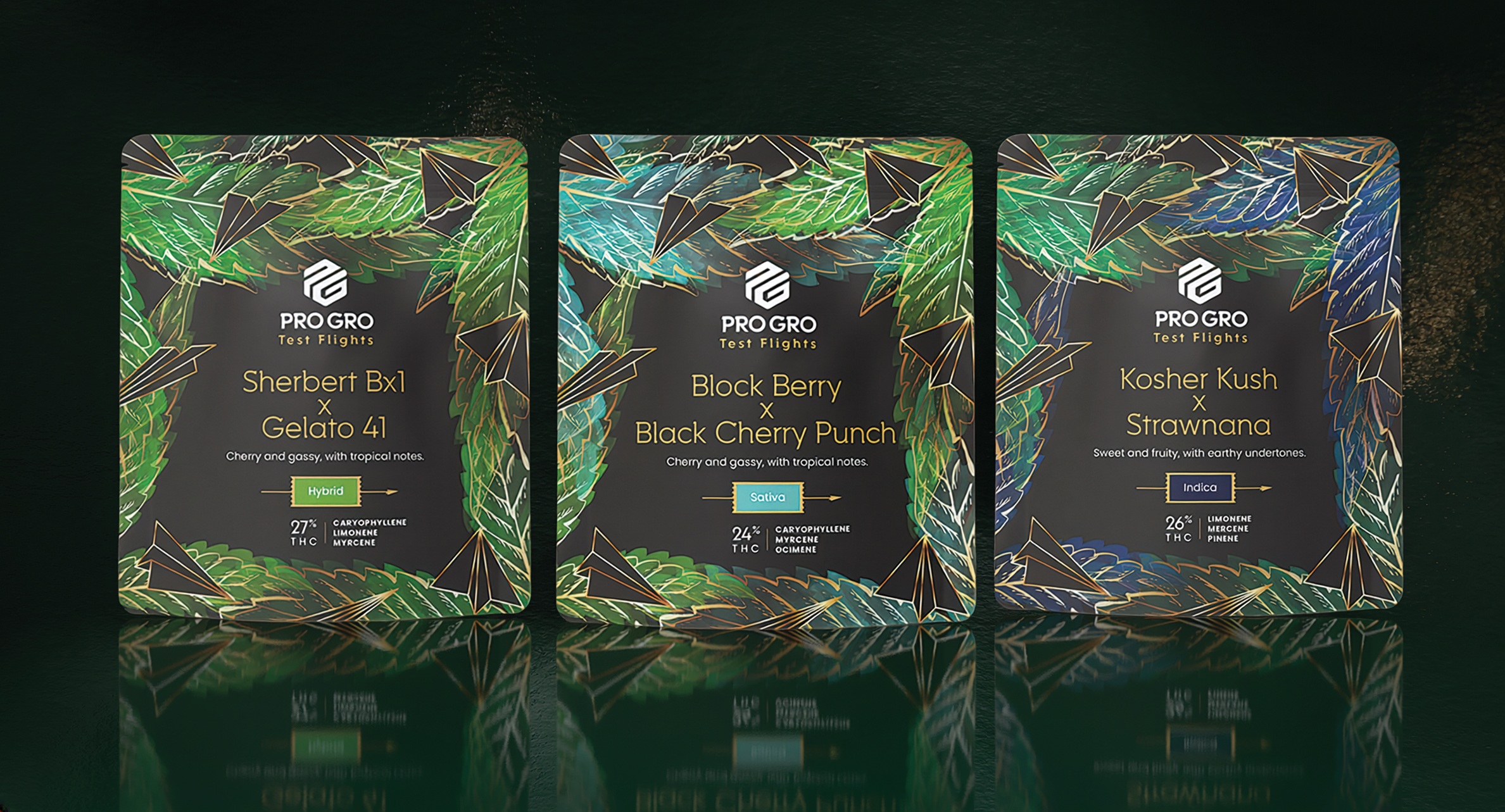
This ran the way design work used to before things got fast — real back-and-forth, "it's not premium enough yet, what can we do about that, let's try it." Out of that came the actual hierarchy: strain name and branding built to read clearly from four feet away, since that's the real distance a shopper sees a shelf from. Everything lower-priority sat close to the strain name instead of competing with it, and color coded the line by type — indica, sativa, hybrid told apart at a glance, before anyone read a word.
The Standard That Wasn't There Yet
The logo had never been given real rules, so every packaging run had bent it a different way. What looked like a lack of process from the outside was really the product of a broken system, not the people working inside it — so I focused on building the standard first, rather than assigning blame. Once real guidelines were in place, the existing team was receptive to every bit of it.
Working with the lead designer on-site — someone who understood the local cannabis culture better than I ever could, and who taught me plenty about tools I hadn't used yet in return — I started by standardizing what should have existed from day one: a single-color logo, light on dark or dark on light depending on the background, consistent across the whole line.
DESIGNED TO SCALE AROUND A HARVEST.
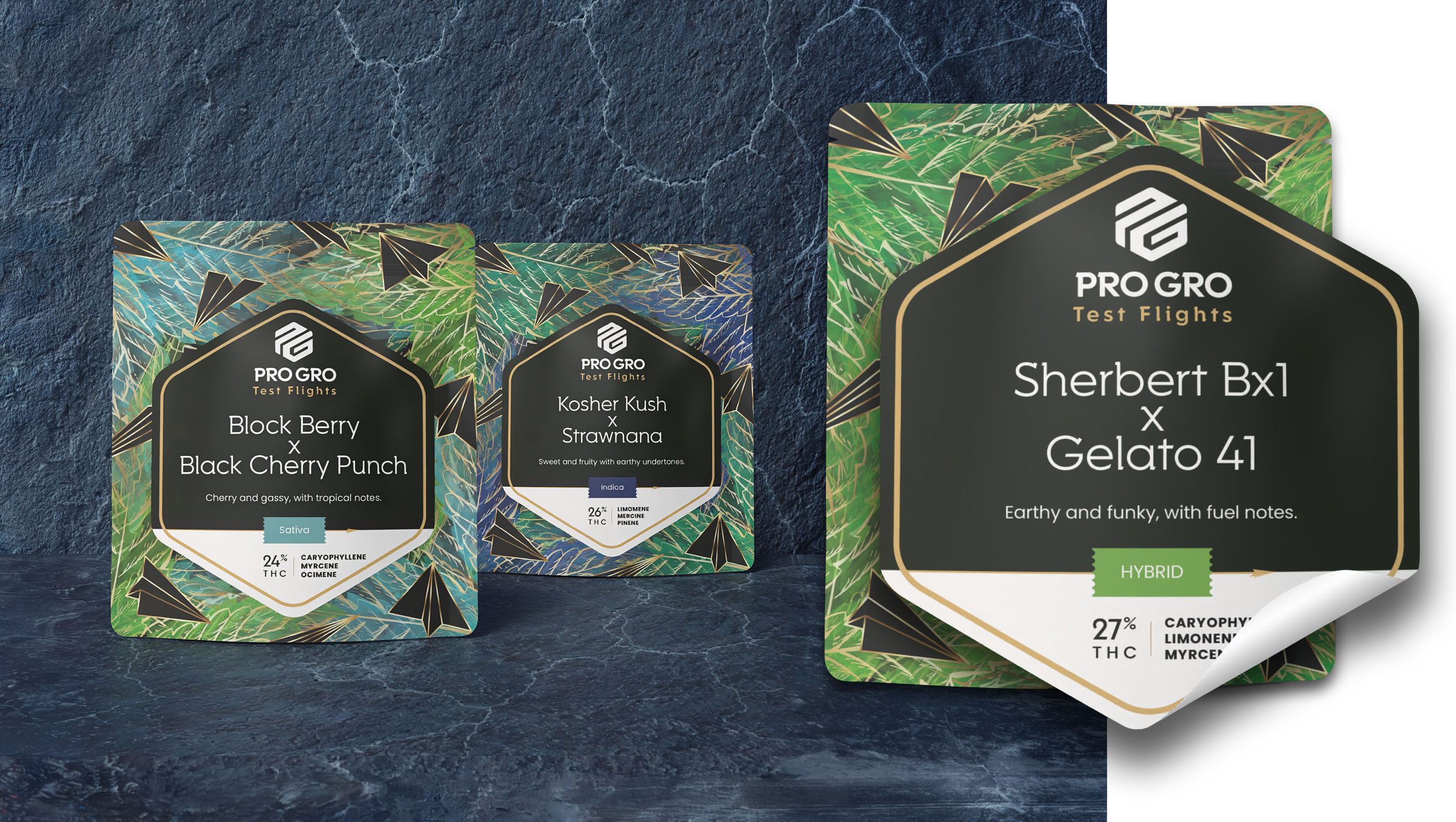
Every pairing shown here is a render — full custom printing was the version we pitched to launch with, since it looked right for proving the concept. But printing a full new run every time a strain pairing changed wasn't going to hold up once the "new every month" model actually had to run at scale. Each room in the cultivation facility ran its own timeline toward harvest, and harvest — not a marketing calendar — decided which strain and how much volume actually made it into a bag. I pitched a hybrid production system instead: bulk-print the base bag by category — hybrid, sativa, indica — since that stays constant, then apply a smaller variable sticker carrying the specific strain pairing and terpene profile as each new drop launched. It solved the real cost and lead-time problem sitting underneath the whole program. I left the company not long after pitching it, so it never got built — but the thinking holds up on its own.
THE PACK SHOTS LOOKED REAL BEFORE ANYTHING WAS EVEN PRINTED.
Pitching a packaging system usually means rough mockups, or a photography budget nobody had yet at this stage. The only deadline was "as soon as possible." So I pushed for speed and fidelity on purpose: show something that looked genuinely finished immediately, then use that as the argument for a better process going forward, instead of asking for process first and hoping it got granted. I directed AI-generated lighting and rendering to turn flat design files into pack shots that looked photographed — working alongside the designer who had deeper hands-on fluency with the tools at the time, while I held the standard on brand consistency and what the images actually needed to communicate. It got the concept in front of the client the way it would eventually actually look, without waiting on a shoot that wasn't budgeted.
I PITCHED THE WHOLE FLIGHT, NOT JUST THE BAG.
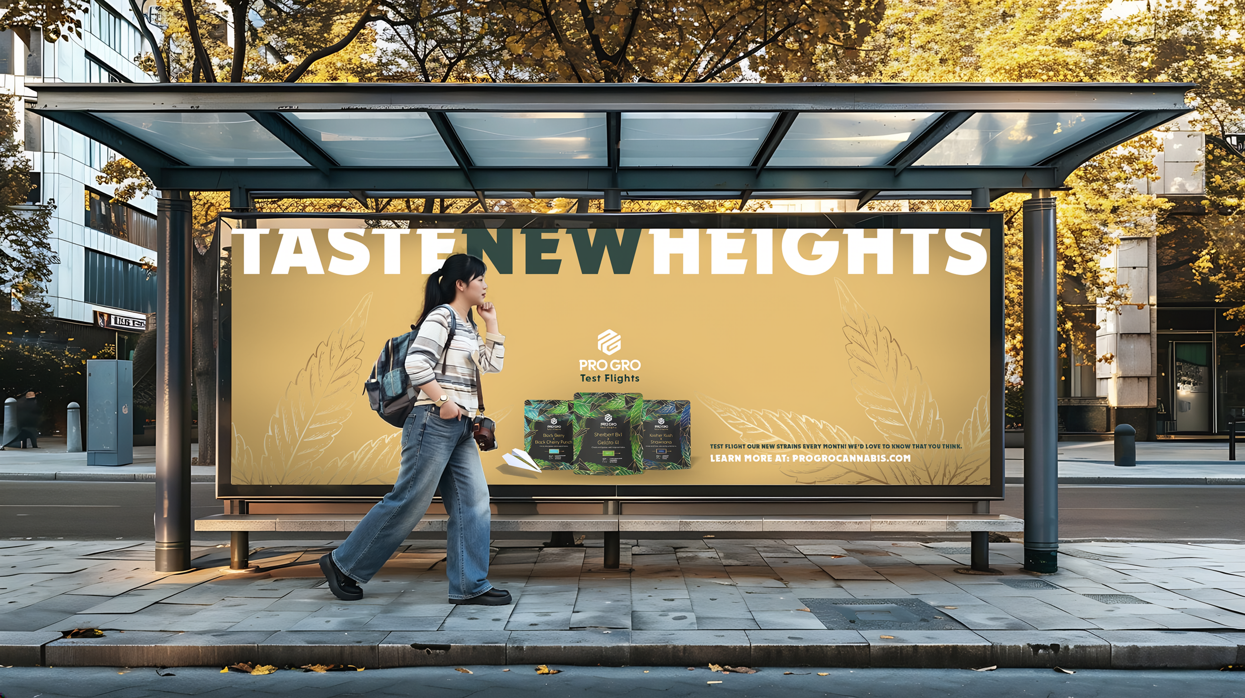
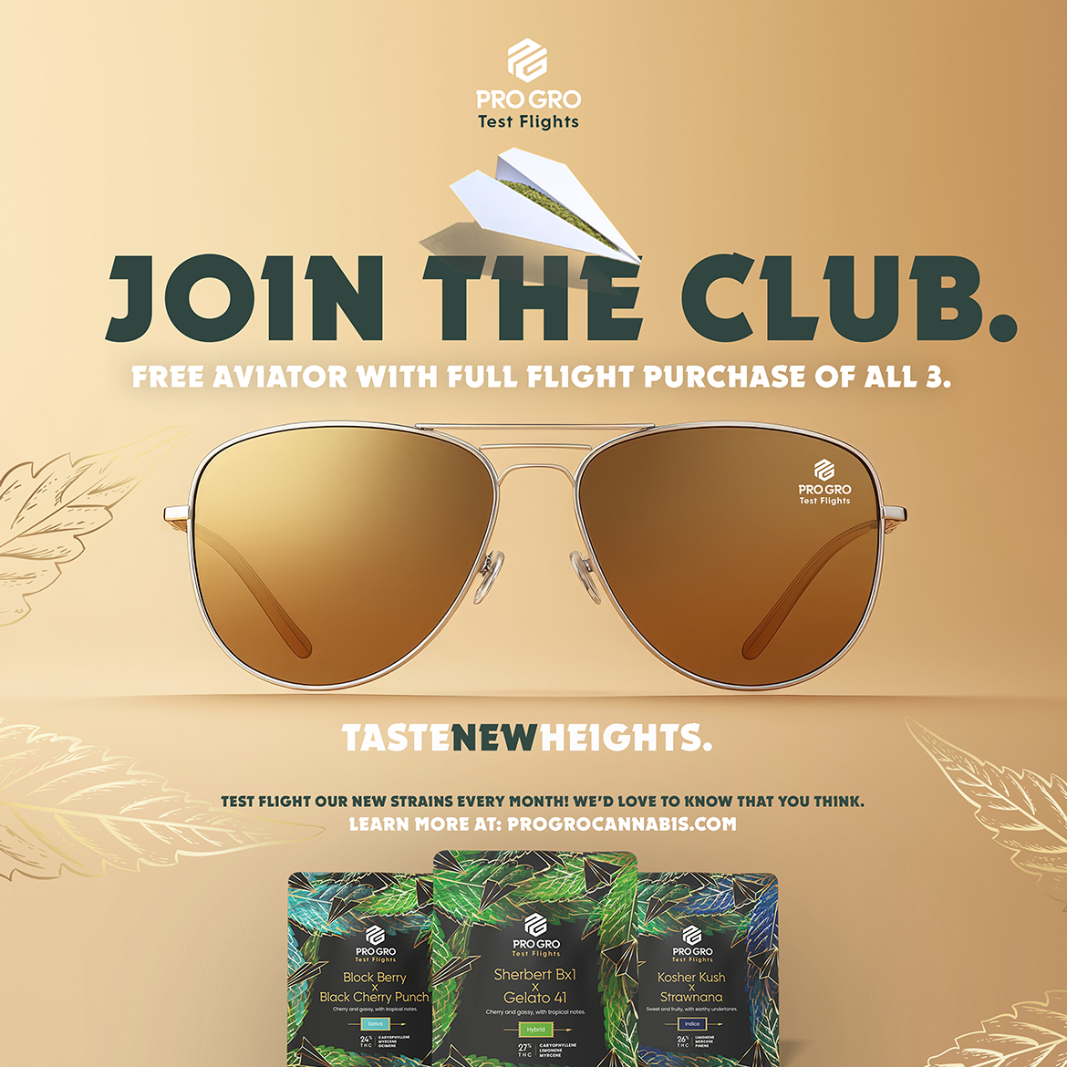
Taste New Heights was the full launch I pitched on top of the packaging. It was in motion when I left, so none of it ran — but I built it all the way out anyway. When a program doesn't have a direction yet, a finished-looking one gives everyone something to react to. Moving somewhere beat standing still.
It carried the same system straight off the bag — the paper airplane, the gold linework, the same restraint. On the bus shelter, the headline pushes up until it nearly clips the top of the frame — the words reaching past their own container, since the whole idea was already about going higher. The loyalty mechanic tied straight back to the core behavior the program was built around: buy the full flight of three, not just one strain, and unlock a branded pair of aviators. Join the club.
The system extended into a real product tie-in too — a rolling papers box carrying the same look, folding the paper-airplane metaphor back into something people would actually use.

JOYNT TO THE WORLD ✦ HIGH. LUV YOU. SO MUCH! ✦ HAVE A HOLLY JOLLY HOLIDAY ✦ LET'S ROCK THIS JOINT! ✦ MERRY MUNCHIES ✦ I'M HIGH ON YOU BABE! ✦
JOYNT TO THE WORLD ✦ HIGH. LUV YOU. SO MUCH! ✦ HAVE A HOLLY JOLLY HOLIDAY ✦ LET'S ROCK THIS JOINT! ✦ MERRY MUNCHIES ✦ I'M HIGH ON YOU BABE! ✦
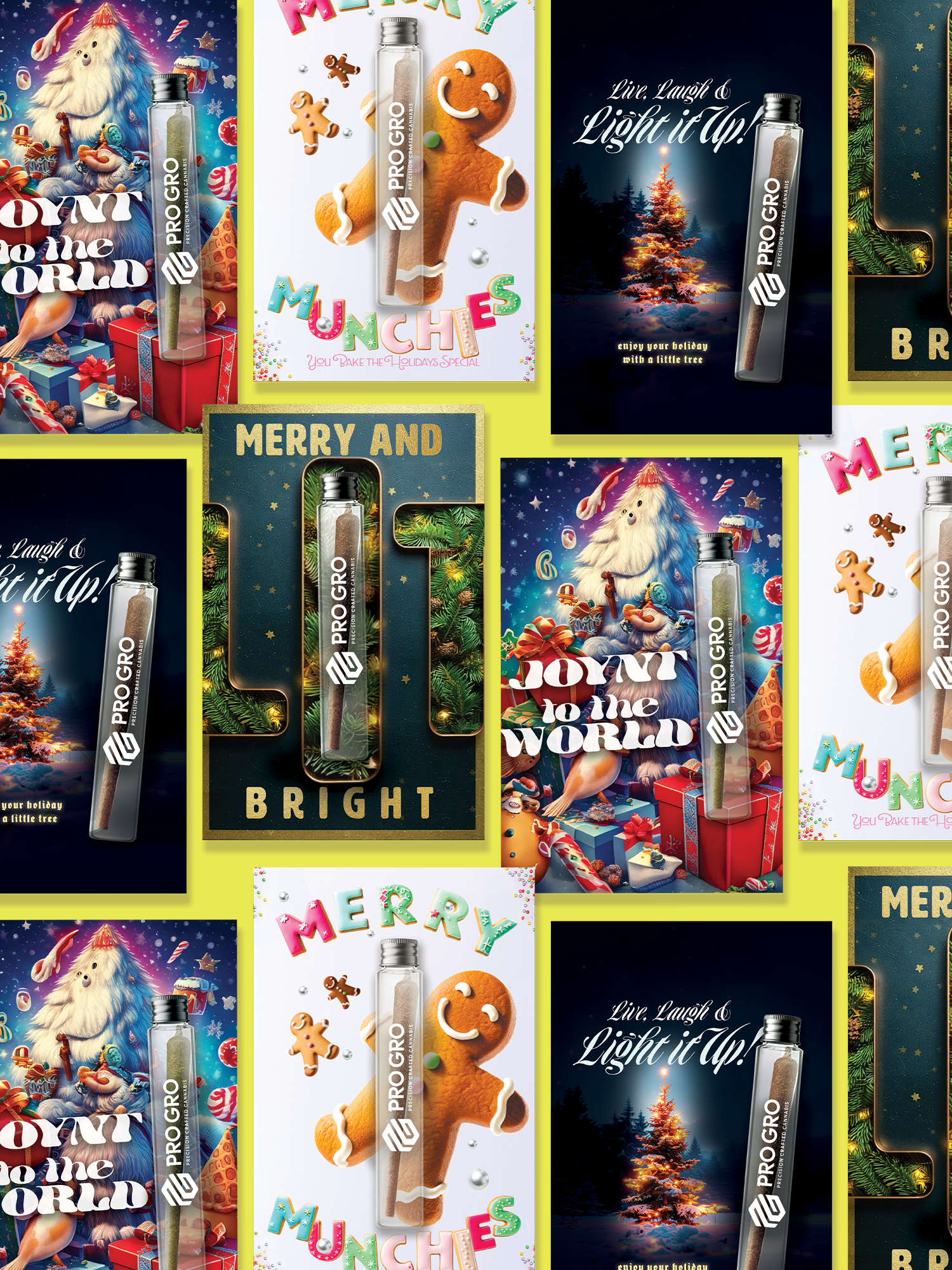
holiday cards
The Real Ask
The idea itself came from the account lead — she wanted holiday cards. I thought it was a genuinely good one, and built everything underneath it: the concepting, the designs, the retail placement, the case for a real launch plan around something that didn't have one yet.
In one week, I wrote, designed, art directed, and produced every card, and did my own research into who each card was for — then pitched a launch campaign on top. Concept to production in a week wasn't a stretch goal. It was the only version of this that got made. AI is what made that week possible without lowering the bar.
They wanted the cards, not the campaign. That was the assignment, so the cards got everything, and I didn't stop at the card.
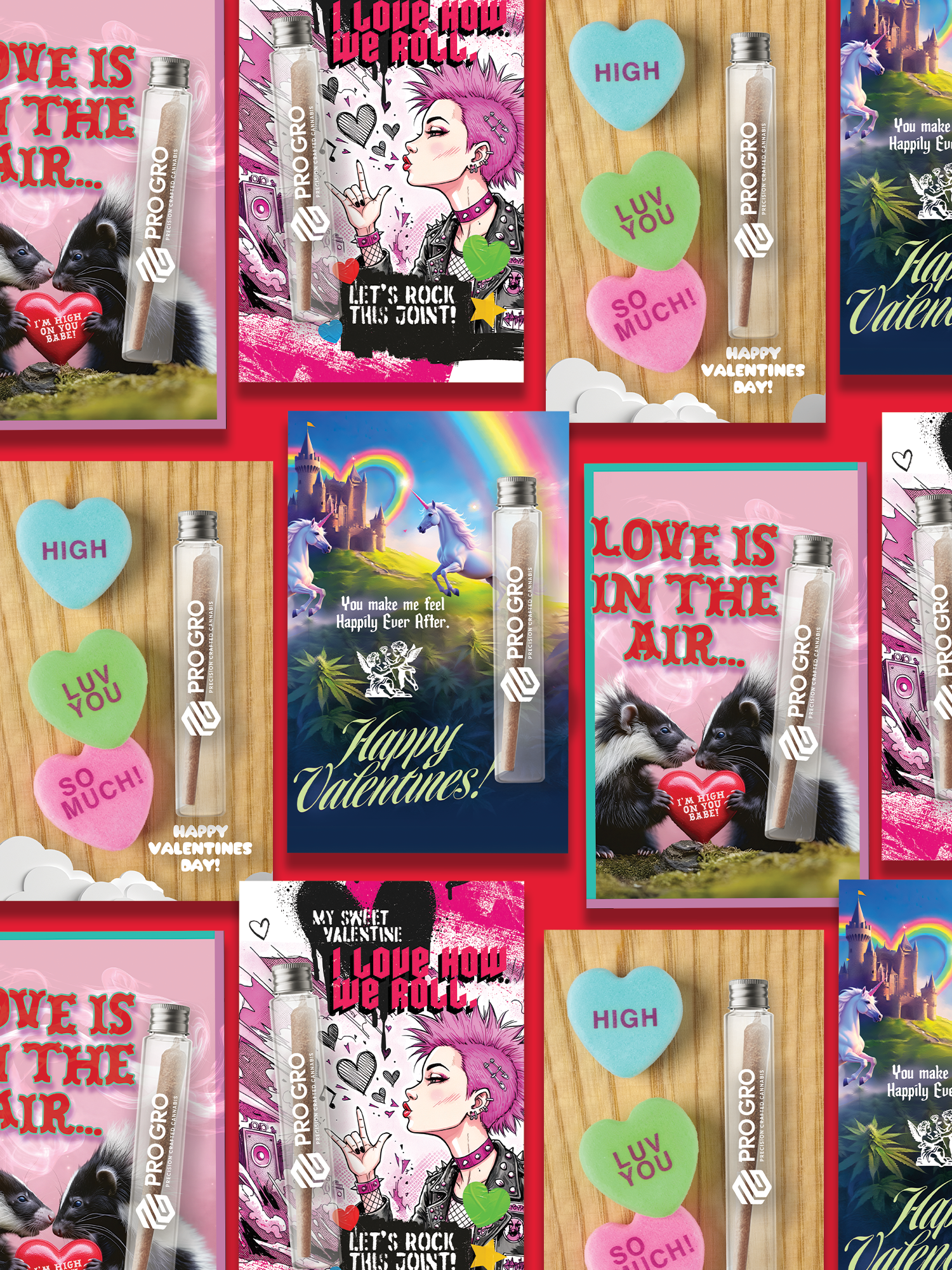
NINE CARDS, NINE DIFFERENT PEOPLE AT THE COUNTER.
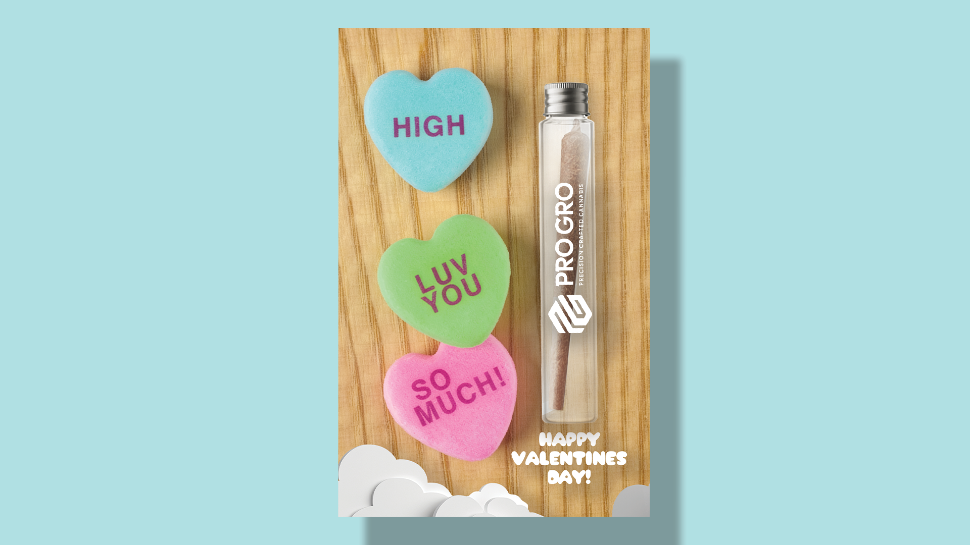
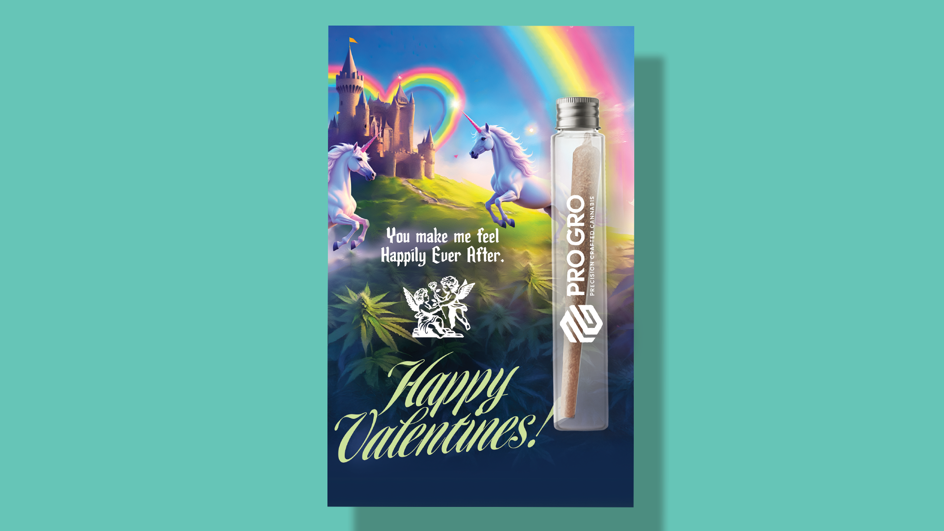
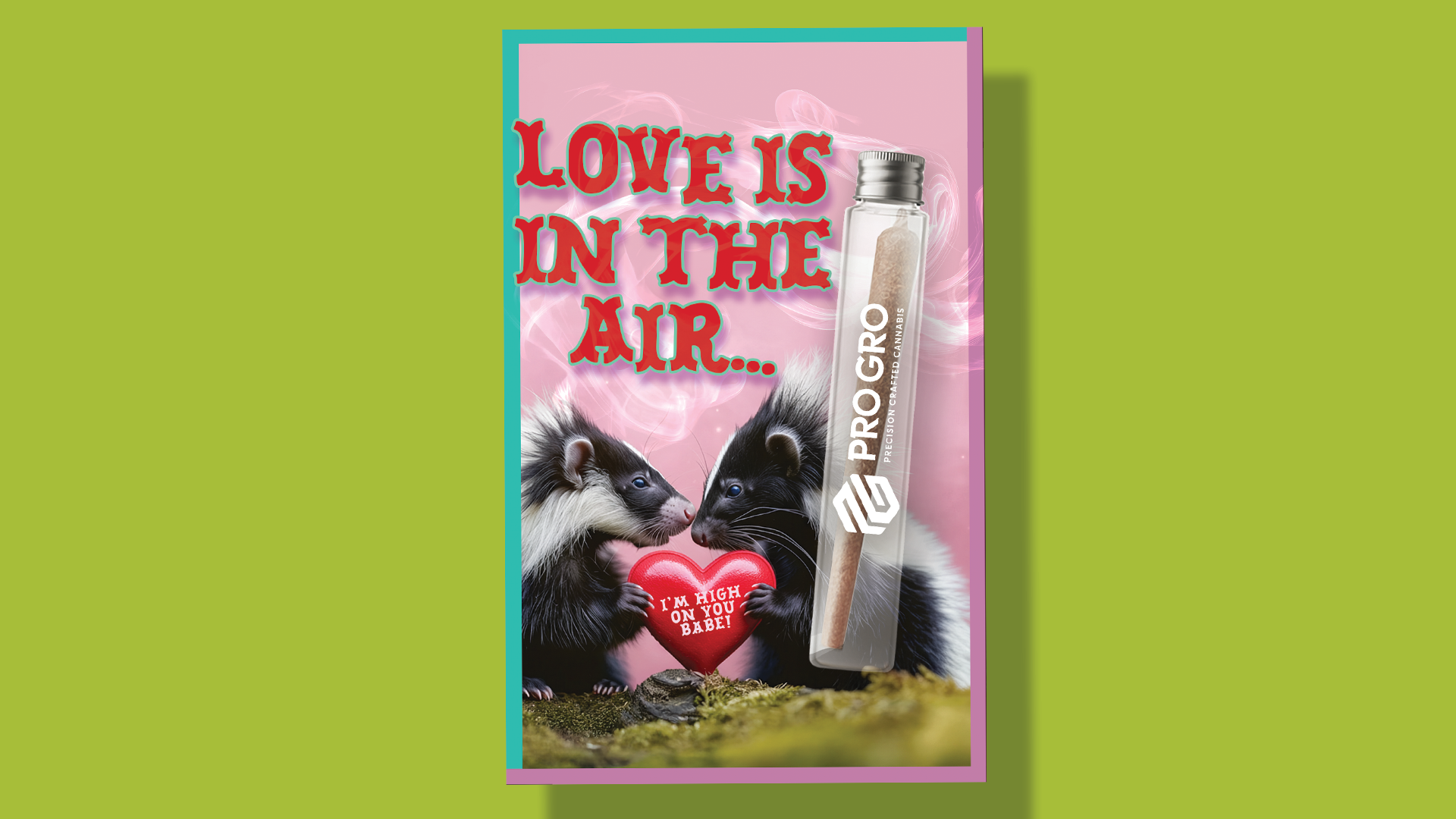
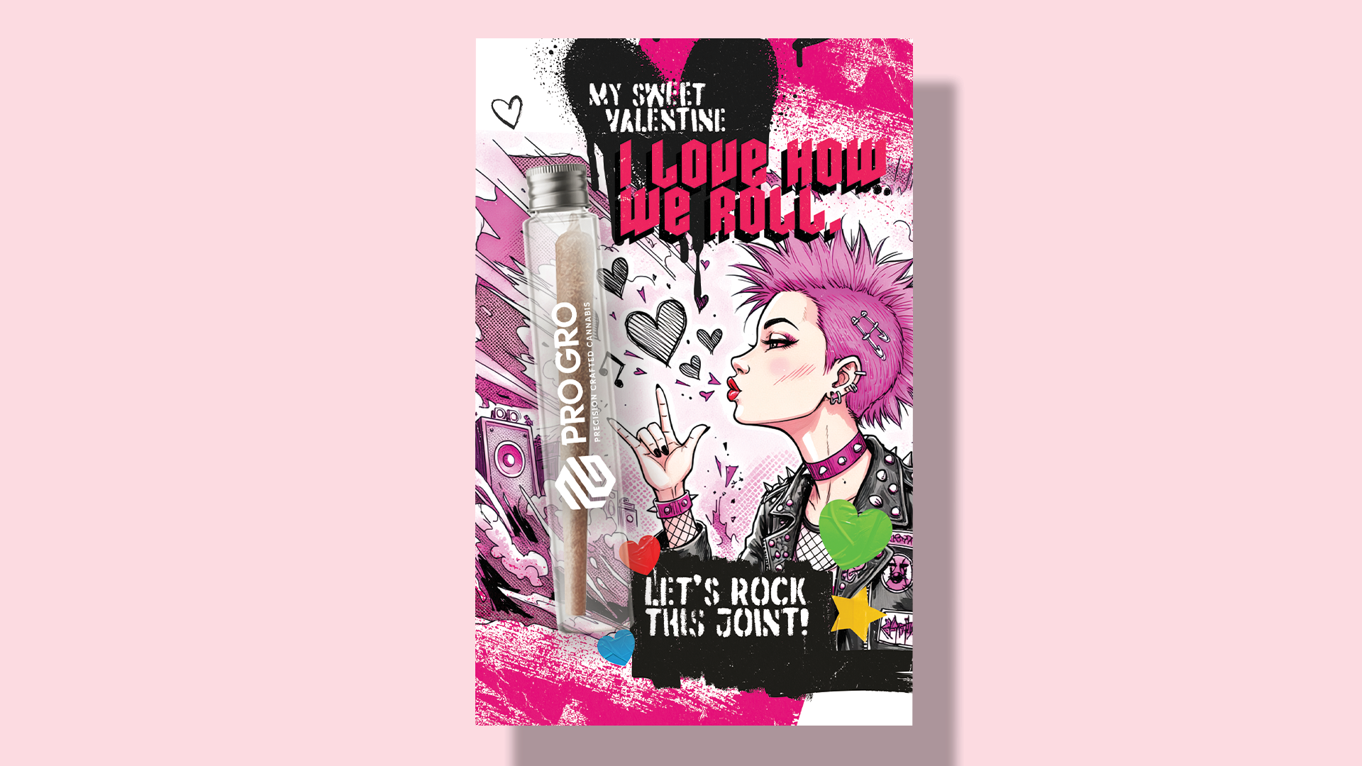
Every card started from a real cultural reference, and the tone changes card to card on purpose: candy hearts, a fairy tale, a skunk pun, a punk love note. The filter was whoever's standing at the counter — age, gender, taste, the subculture they came from. The line I kept walking: not so inside a joke that someone feels dumb for missing it, not so simple it reads as lazy, unless the simple was the joke.
The type on those candy hearts looks etched into the sugar, not pasted on. That used to be hours of compositing. Here it took minutes.
-
![]()
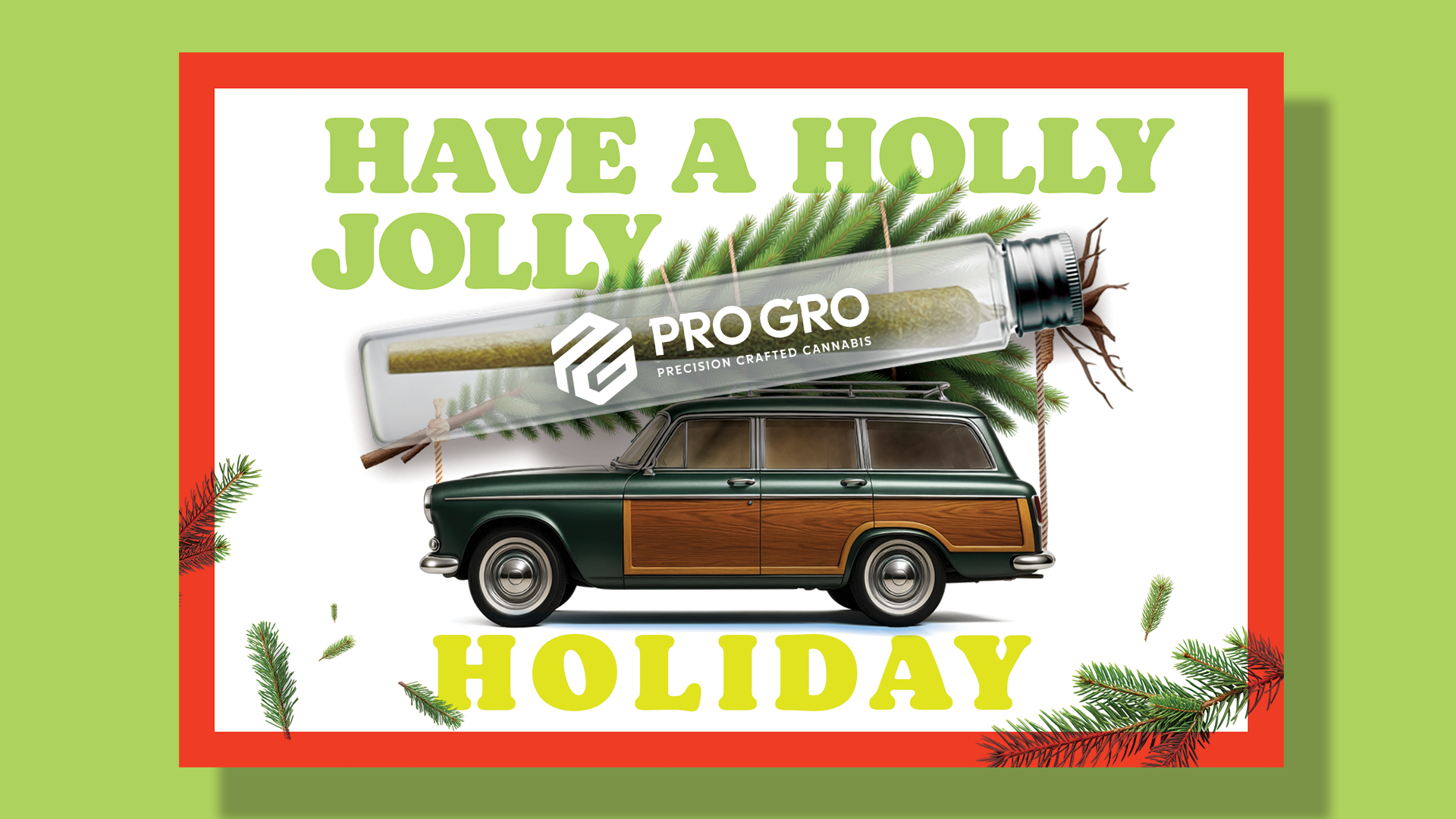
Have a Holly Jolly Holiday
The tree-on-the-roof photo every family has. This tree came in a tube.
-
![]()
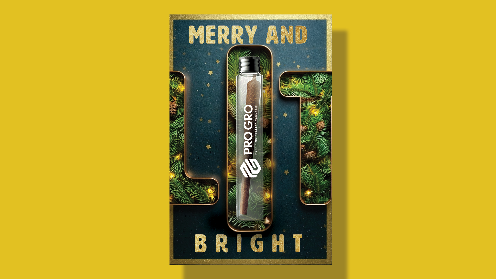
Merry and Bright
The classic line, with a three-letter upgrade in the middle.
-
![]()
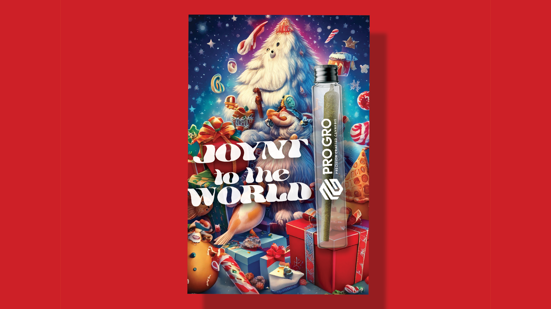
Joynt to the World
Maximal on purpose. The AI look was the joke, so I left it showing.
-
![]()
Live, Laugh & Light It Up
The kitchen-wall slogan, finished the way this crowd would finish it.
-
![]()
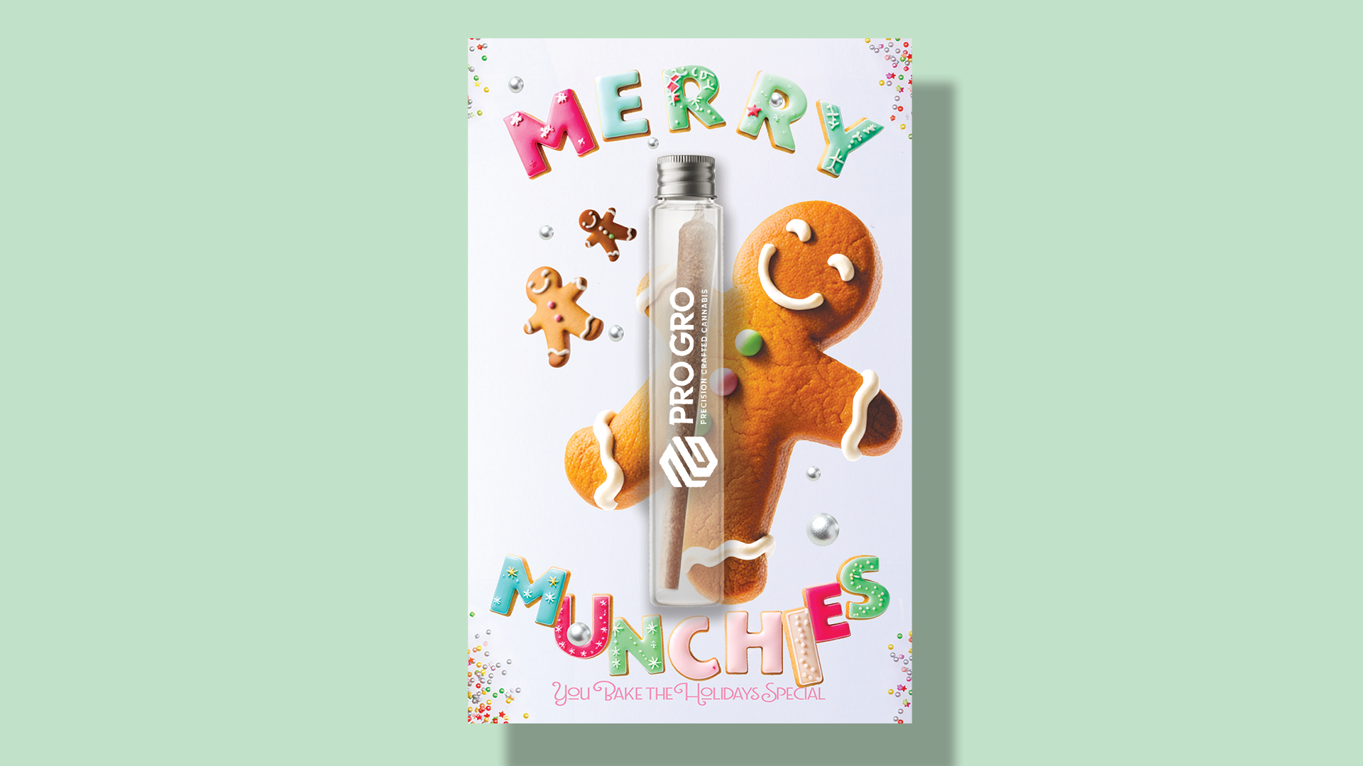
Merry Munchies
The gingerbread man gets it. "You bake the holidays special" reads two ways.

-
![]()
HIGH. LUV YOU. SO MUCH!
Conversation hearts with two letters added.
-
![]()
You make me feel Happily Ever After
Castle, unicorn, cupid, all of it. Valentine's is the one holiday where too much is the right amount.
-
![]()
Love is in the air… I'm high on you babe!
Growers call a strong, pungent strain "skunk." Everyone else sees a skunk in love. Both readings work.
-
![]()
I love how we roll… Let's Rock This Joint!
Loud color, high contrast, three chords. Built to land with women as much as men, on purpose.
A WALMART SHELF STRATEGY, RUN THROUGH A CANNABIS BRAND.
The bundle was part of the ask: pick a ProGro strain, pair it with a card and envelope at a discount, gift-ready. It ran — and it only worked as a value because the cards didn't carry an outside production cost. Outsourced, that cost would've eaten the discount before it hit the shelf.
What I added was where it lived. I pitched the bundle for countertop placement — the same visibility play I'd run for years getting P&G brands noticed in Walmart, in a category I'd never worked in before. What shipped was a header display. What I pitched past that was a pre-sell: people walking in already knowing the cards existed, not finding them at the register.
AI STEPPED IN. THE CALLS STAYED MINE.
Two systems, three months, a two-person team. Between them, this page covers the whole chain — strategy, naming, concepting, cultural reads, planning, design, art direction, production, and what a timeline can actually hold. Every one of those, I've done myself. That's why I know what to ask for when someone else is doing them.
AI is the newest job on that list, and I learned it on a live deadline. Every call on this page — the name, the plane, the gold, the palette, the hierarchy, who each card was for, where the bundle lived — came from direction, not a prompt. AI stepped in where production was the bottleneck: pitch-ready pack shots before a photo budget existed, and a compositing library I couldn't license fast enough.
I direct it the way I've directed an illustrator, a stunt driver, or a crew. The standard is mine. The eye is mine. Knowing every seat is what lets me run the room.