
THE SCIENCE WAS ALREADY STRANGER THAN THE AESTHETIC.
Regeneron needed five internal videos explaining dense biotech science to an audience that included the scientists who'd actually built it — people who'd catch a soft explanation in a second. I pitched full-screen, retro-futuristic 80s pixel art as the visual language, on the bet that the real science was already weirder than anything that aesthetic could throw at it. Lean into that strangeness instead of smoothing it out, and the videos get more interesting, not less accurate.
I’D BEEN READING THIS KIND OF MATERIAL SINCE I WAS A KID.
My mother’s a microbiologist. Some of my earliest memories are trips to UPenn with her, and reading real disease textbooks for fun instead of comics. That’s why I could sit across from working scientists reviewing a script for accuracy and hold my own. I wasn’t translating the science from the outside. I knew enough of the language to catch a simplification that crossed into wrong.
One of the five, Biology + Technology: A Love Story, was the easy one for me. I learned to love science the way you learn to love anything a parent won’t stop pointing out.
IT WASN'T JUST GOING ON A WEBPAGE.
These lived on Regeneron's public site, same as you'd expect. But part of the ask was internal TVs in the hallways of a lab building — not a screen I controlled end to end, just one of whatever was playing there alongside other things. That's a different design problem than a webpage: it has to read clearly at a glance, hold up next to whatever else shares that screen, and survive the kind of scrutiny you only get from people who could tell you exactly where the biology is wrong.
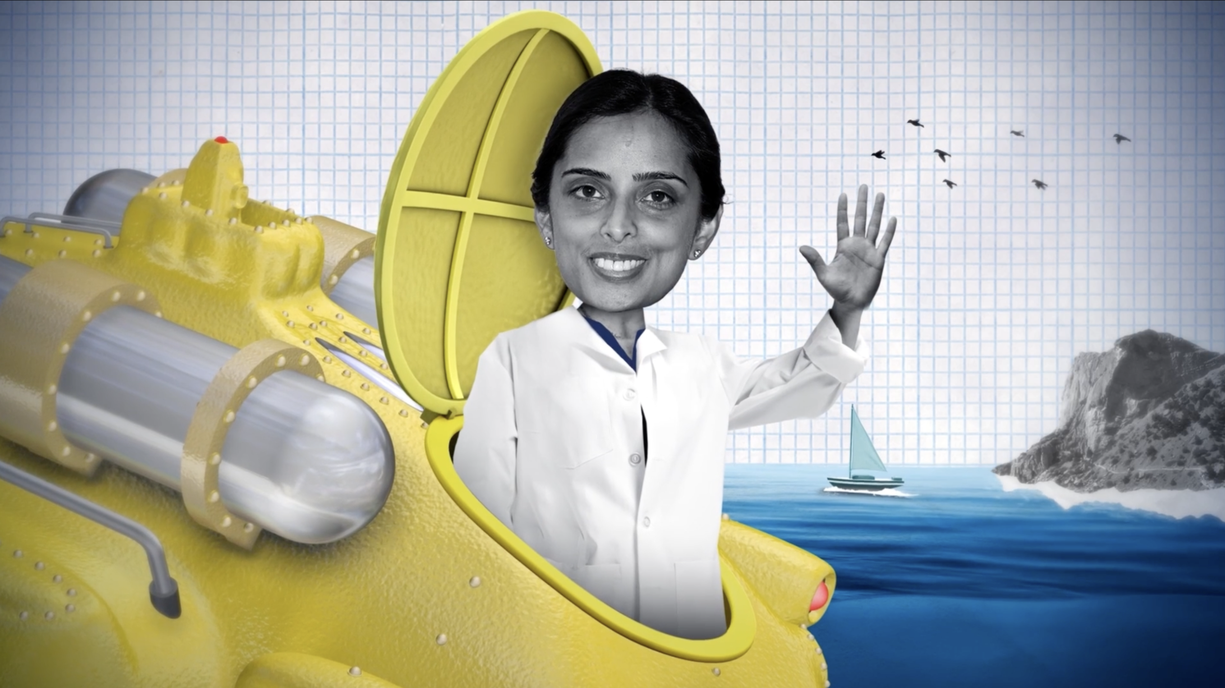
NO SHOOT, NO BUDGET, NO EXCUSE.
There was no photography budget — the source material was employee screengrabs and phone photos. Usable for a hallway monitor loop meant building a standard from nothing: front-lit instead of backlit, a simple background, chin slightly up, shot straight-on, head kept isolated in frame. Simple enough that anyone taking their own photo on a phone could follow it without creative supervision, and consistent enough that the retouched results could sit next to each other on screen without looking like five different photoshoots. People followed it.
IF MY MOM COULDN'T FOLLOW THE BRIEF, IT WASN'T SIMPLE ENOUGH.
Writing the photo instructions, I used my mother as the test case: could she read these four lines and get it right on the first try, with no one standing over her shoulder? That's the same instinct behind the QR-code flow on Meritage — usability isn't just a consumer-facing concern, it's what makes an internal ask actually get done instead of bounced back five times. Simple isn't the absence of a standard. It's a standard anyone can hit.
GIVEN MORE RUNWAY, THIS BECOMES A SYSTEM, NOT FIVE VIDEOS.
All five were made and shown, on the public site and the hallway TVs. I don’t have view numbers, and the fifth changed hands after I’d moved on, so what’s here is only what I know we did. The hallway screens were a rally cry for the people whose work was on them. That isn’t a metric, and I won’t dress it up as one. With more runway, this is where I'd push next: a campaign built to run continuously instead of five finite drops, with real touchpoints beyond the building TVs and a way to actually know if it's working. That's the version I'd pitch today.